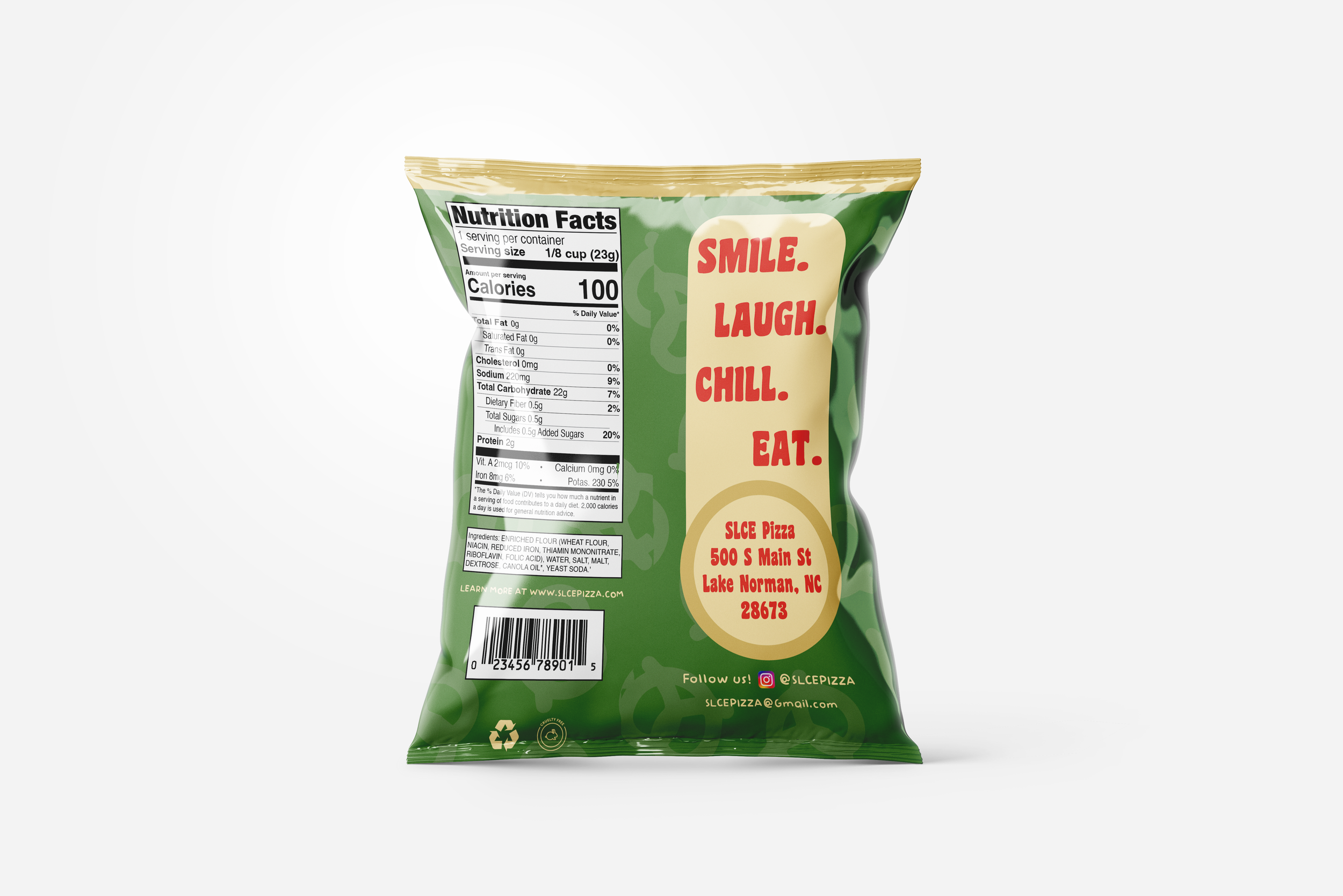
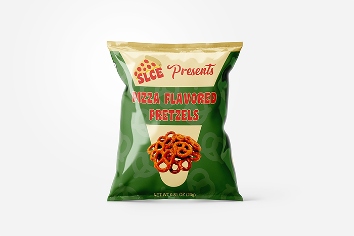
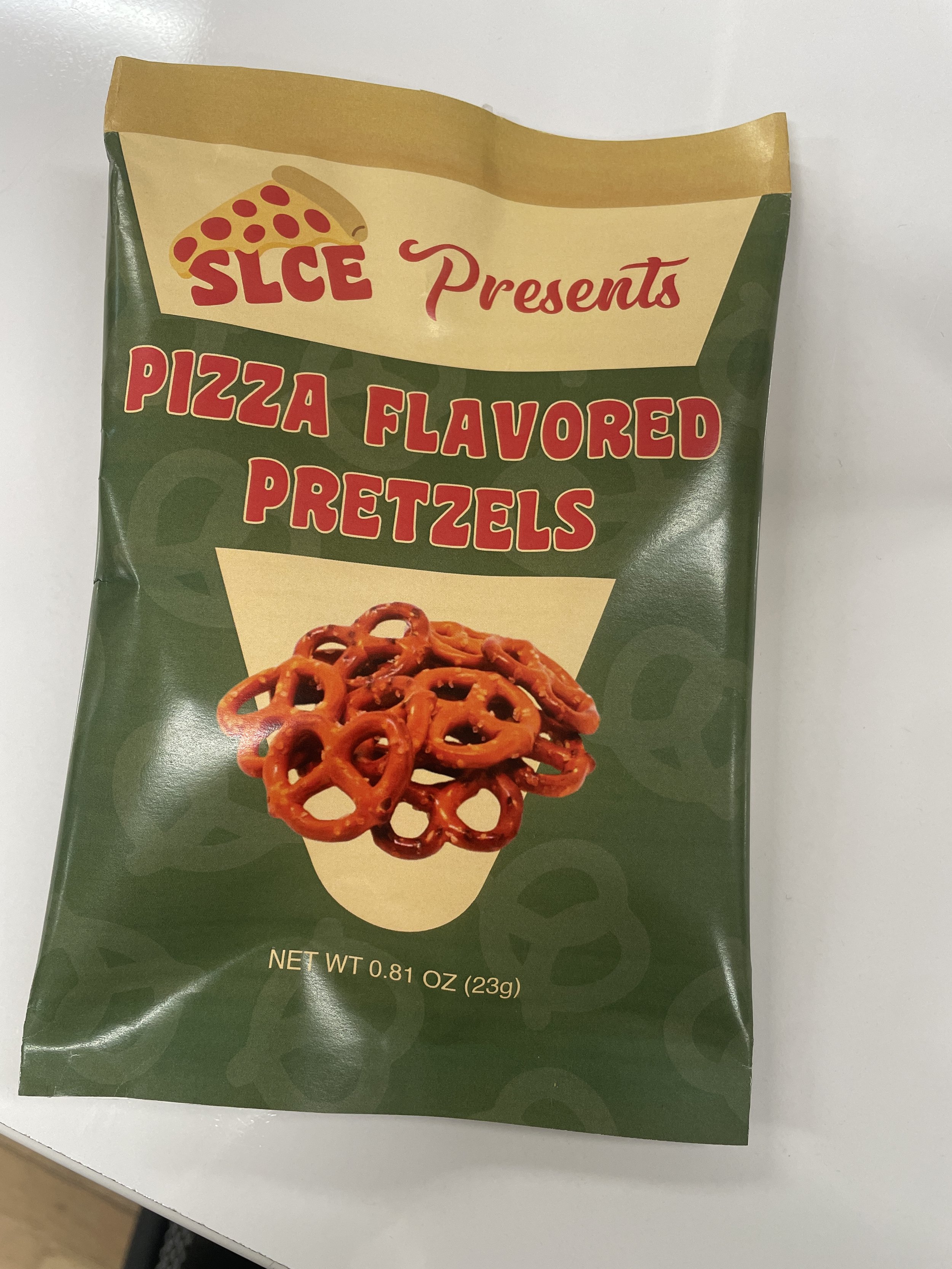
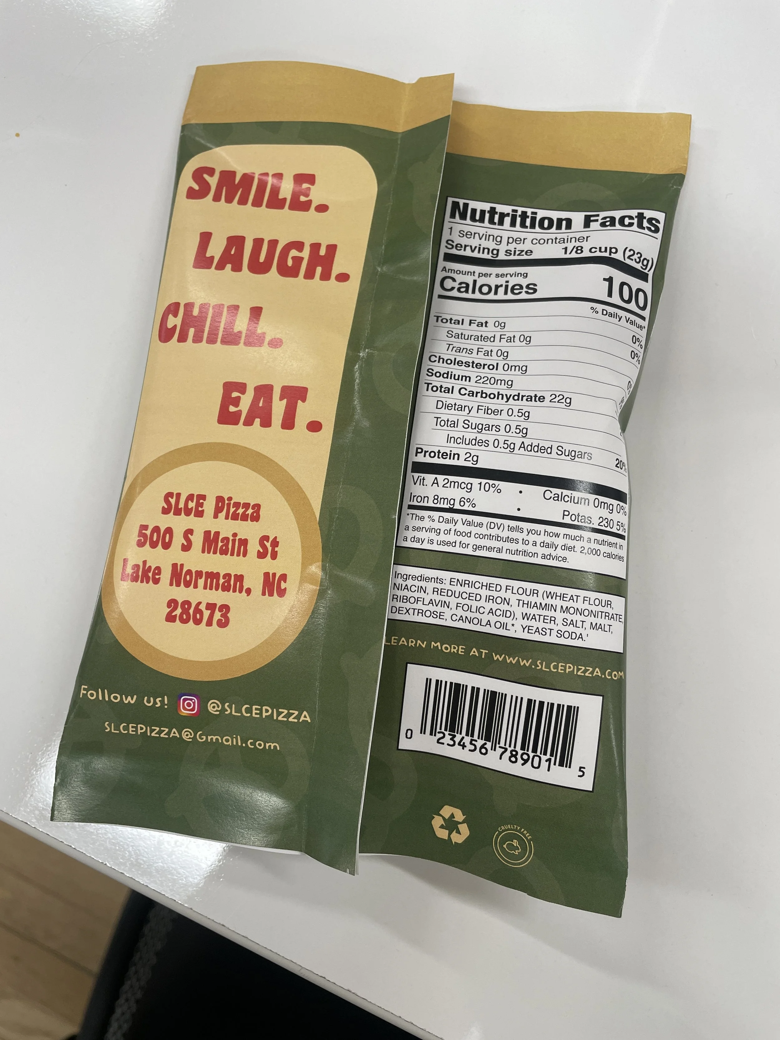
After establishing the brand identity, the project advanced to applying SLCE to a fully realized, functional chip bag. This required translating the visual system onto packaging while maintaining consistency with the brand’s standards across layout, typography, and tone. In addition to the creative direction, the design had to follow legal nutrition facts labeling rules, emphasizing the balance between creativity and real-world production constraints. We then printed and assembled the chip bag.
SLCE
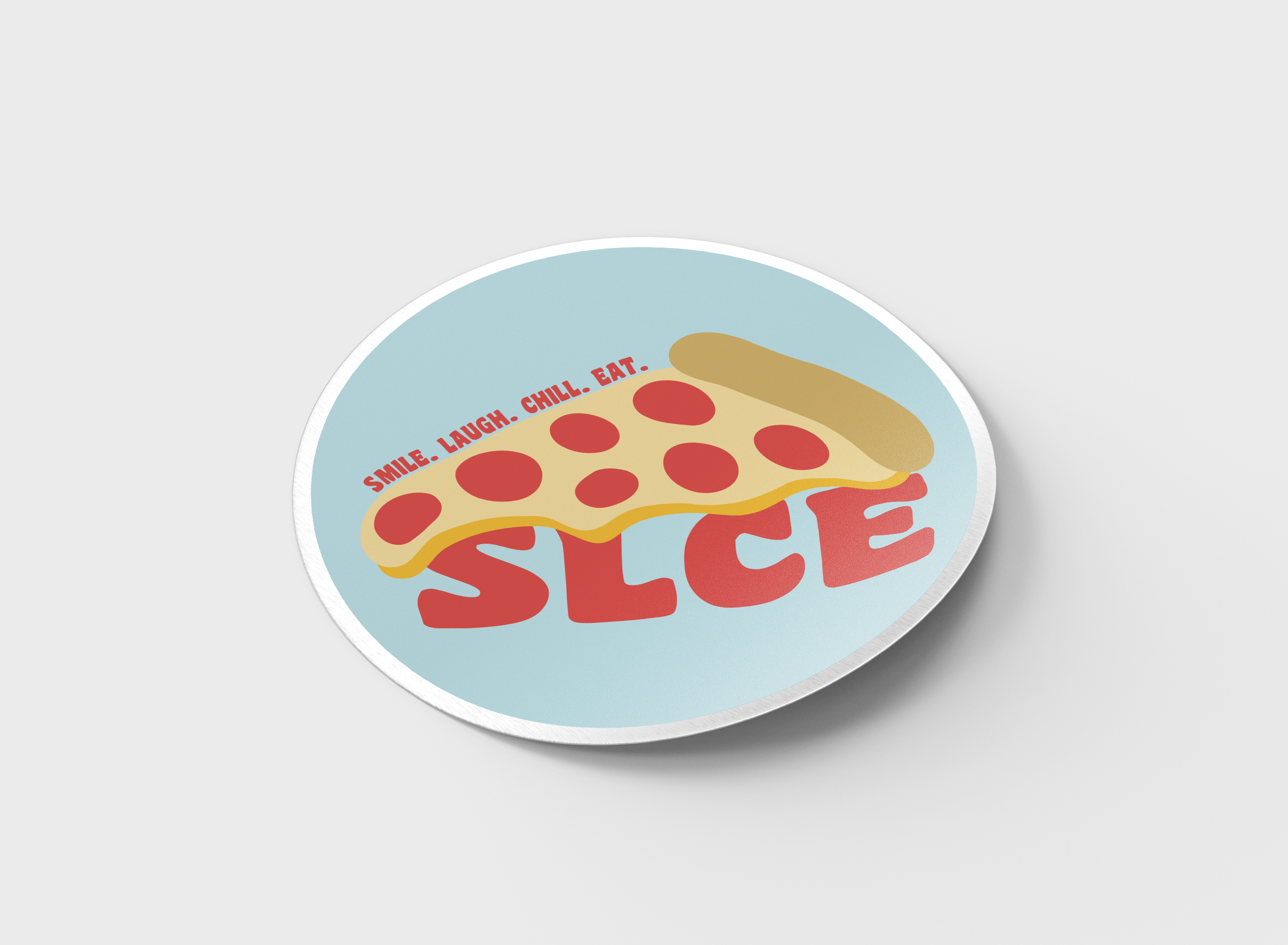
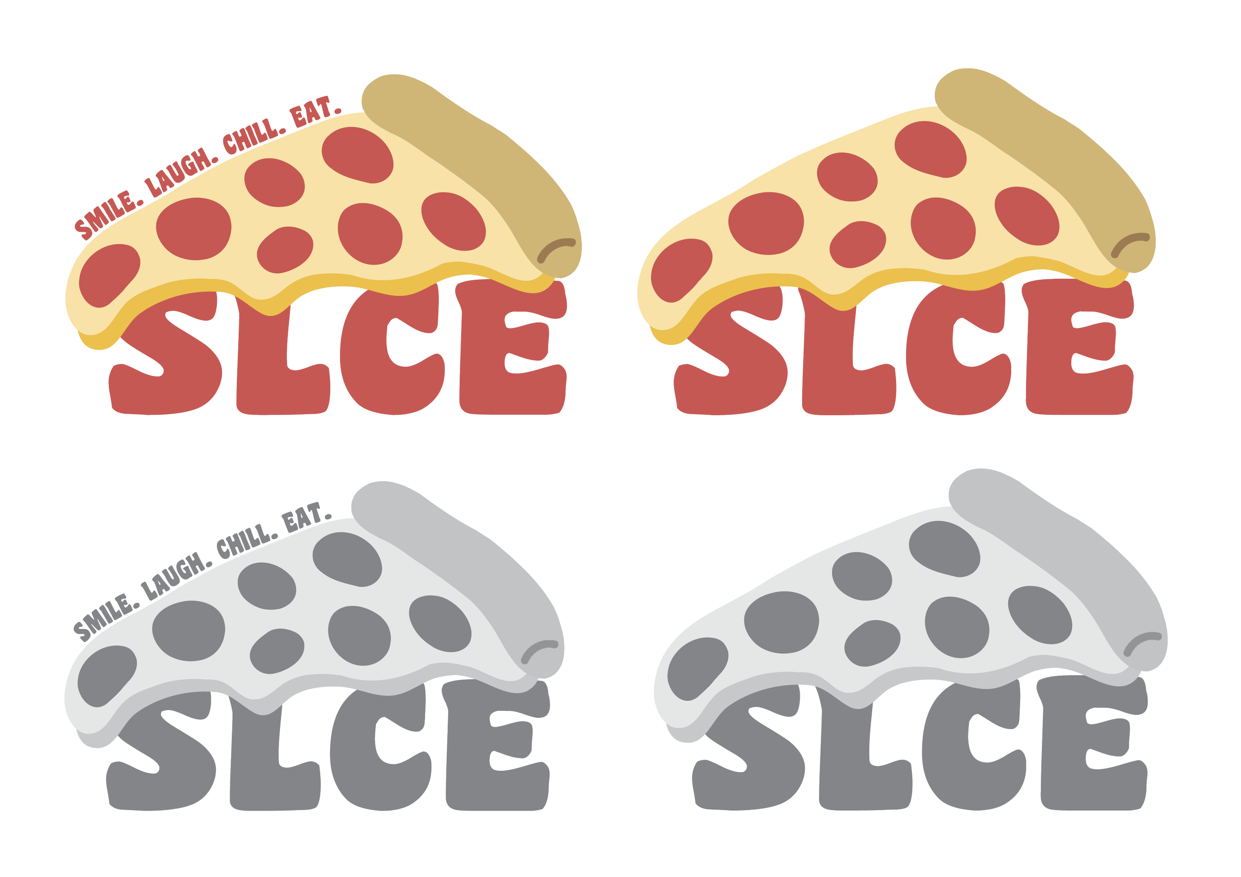
SLCE is a conceptual pizza brand created for a class project, built around the idea of enjoying food without taking life too seriously. The name stands for Smile, Laugh, Chill, Eat, capturing the brand’s laid-back, fun-loving attitude. Inspired by brands like Mellow Mushroom, SLCE embraces a relaxed, playful vibe that feels welcoming and approachable. The visual identity centers on a droopy slice of pizza hanging over the wordmark, reinforcing the brand’s casual personality and lighthearted tone. As part of the project, we were encouraged to design a brand that functions effectively in both full color and black and white, emphasizing the importance of strong, versatile branding. This project focused on creating a cohesive brand that feels fun, memorable, and rooted in the joy of sharing good food.